
Image via The OC Insider
...and nobody needs that.So, Mr. Snow Cone suggested green as an accent color. I don't know about you, but when I think of purple and green together, a certain childhood friend pops into mind:

Image via Ah Beng's World
Although I was initially reluctant to look at purple and green together, I had bombarded Mr. Snow Cone with all of my color palette suggestions over the past few weeks, so I decided it was only fair to look into his suggestion of purple and green. I am partial to a plum shade of purple, so I Googled "plum wedding palette" and came across THE BEST AND MOST HELPFUL COLOR SITE EVER.
That's right, there's a blog called "The Perfect Palette" that has nothing but color combinations and inspiration boards to let you see how various colors match up against each other in a wedding setting! Just imagine my glee at discovering that about 99% of the work of picking color combinations had already been done for me; now all I needed to do was plop down on the couch for a while, poking around this newly-discovered and highly-adored blog.
One of my favorite parts about this site is that you can sort by color, so instead of slogging through all of the color combinations, you can get right to the meat of it. At the same time, let's say you have 3 colors picked out, for sure. On this blog, you can easily scope out inspiration boards that show each of your three colors as the primary color, with the other 2 as the complementary tones, helping you to decide exactly how you see this color palette being applied to your individual wedding. Some of the combos have two colors, a traditional and classic approach, while some have up to five, giving you an idea of how the hues can layer on top of each other without looking like you used a clown as your wedding designer.
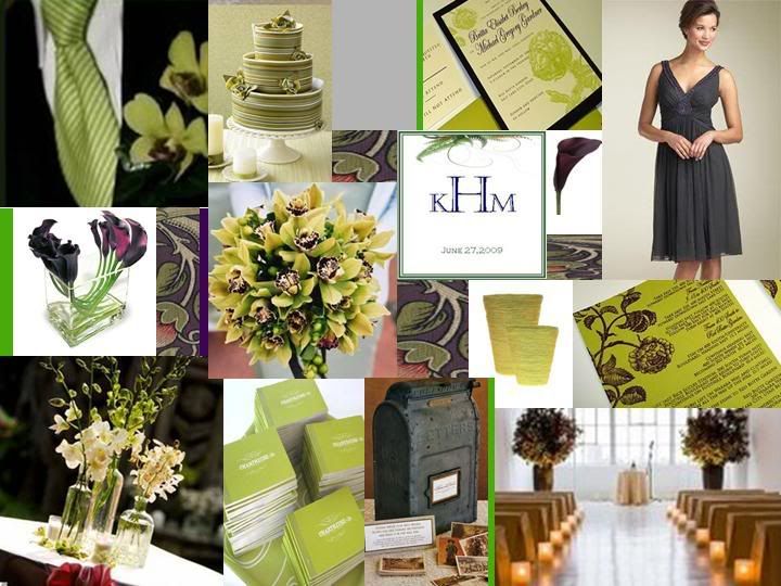
Mr. Snow Cone was equally impressed with this website find (I think mostly because it meant that we could stop talking about color palettes in the very near future), so we hunkered down and spent about 10 minutes looking at pictures and debating until we settled on our final color scheme: purple, light green, and gray. As of now, we're planning to use gray as our secondary color and green as more of a tertiary accent, but either way, I'm relieved we finally settled on something, not to mention totally in love with our selection.

Cake: Image via TheKnot / Photo by Look Photography / Cake by Classic Confection Cakes
Pew flowers: Image via TheKnot / Photo by Alliance Photography / Flowers by Indigo Floral
Bridesmaids: Image via TheKnot / Photo by Melissa Jill Photography / Dresses by Priscilla of Boston
Boutonniere: Image via TheKnot / Photo by L Photographie / Boutonniere by Thorn Studio, LLC
Bouquet: Image via TheKnot / Photo by Kay English Photography / Bouquet by Bridal Bouquet Design
Groomsmen: Image via TheKnot / Photo by Elizabeth Messina Photography / Attire by Banana Republic
Menu: Image via TheKnot / Photo by Marni Rothschild Photos / Menu by Studio R
Shoes: Image via TheKnot / Photo by D. Bryant Photography
It's modern and traditional all at the same time, which is exactly the look/vibe that we're going for with the entire event. Thank goodness for unexpected website finds that make life 100 times easier!
Did you have a surprise, lucky internet find that helped with your planning problems?
Did you have a surprise, lucky internet find that helped with your planning problems?
i am spending all my time at work looking at color palattes instead of doing actual work. damnit, jill.
ReplyDeletep.s. this is kate, duh.